( No Title )
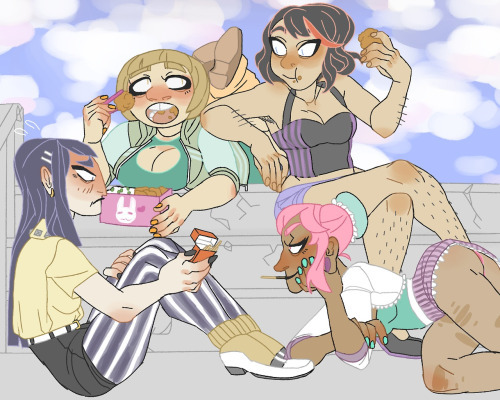
as long as we’re talking tumblr art style, here’s the most horrifically quintessential example i’ve managed to find ever
as someone who’s screwed around in Photoshop and follows mostly art blogs, its kinda interesting to examine the reasons for why the stereotypical tumblr art style is like this. and i think it can be pretty neatly filed into two separate issues.
1) a LOT of the people posting this kind of art are also stereotypical tumblr users – aka edgy sjw types who use “dudebro” as a pejorative and probably identify as “demi-sexual.”
these kind of people tend to be rather… well, they tend to kind of fetishize traits like that. things like: being heavier, more androgynous, and race flipping (only one way though). moreover everything is made to be so “politically correct” that the subject(s) often have stereotypes of minorities forced upon them for the sake of “inclusiveness.” characters are often “headcannoned” to be some other race, sex, sexuality, weight, the list goes on – surprisingly this focus on surface traits isn’t bigoted though (not to them anyway). thus, these specific traits seen in the art are a result of the tumblr culture.
and 2) many of the people posting these kinds of pictures were just not that experienced or talented at illustrative art at the time they produced it – and thats not a bad thing, no one is naturally a great artist.
if we were to criticize the art here simply for what it is (without any connection to the source material) its already filled with composition errors. firstly the composition of the elements is poor, theres no perspective, no gesture, and no focus. simple anatomical issues are common, the bottoms left’s nose shouldn’t be straight from the forehead, and the relative size of body parts is rather distorted, even for a cartoonish style. the coloring leads to similar issues of no focus, everything is saturated in this bright and clashing pastel palate, certain features are way to colored (noses) and are given much more detail than other areas (shading is only on certain parts?).
personally I’m not a huge fan but the maker of this work should still be proud of it. thats what creating art is about so don’t give up. theres nothing wrong about this piece if the illustrator gave it their all. it wont make them the next Monet but even he had to start somewhere.
Reblogging for helpful criticism I can apply to my own art.

Discussion ¬